A review and next steps for the TSPM website, by WRK.
Three websites,one company.
All three versions came out of our work for TSPM: tspm01 and tspm02 as design variants, tspm03 as the content-complete edition.
In short.tspm02 is the best-looking design. tspm03 has the strongest content: one clear promise, one region, real names, a real history, a clear process. The proposal: the content of tspm03 in the design of 02, in four languages, for all of Switzerland.
Three versions, one company. Every site is live and opens directly.
The threesites.
Dark, cinematic, technical
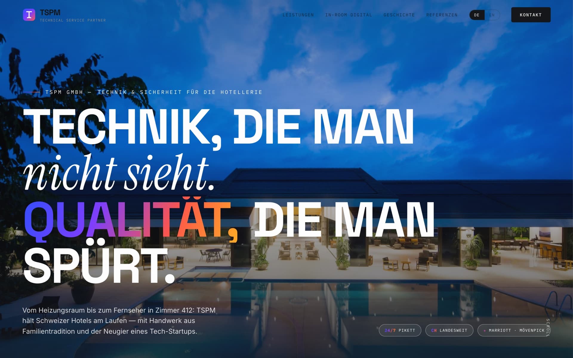
tspm01.wrk.incOne page · DE/EN“Technology you never notice. Quality you always feel.” over a night shot of a hotel pool. Six services, an “In-Room Digital” section with five further offers, key figures, timeline, three quotes, contact form. Dark surfaces, a colour gradient, fade-ins on scroll.
- Strengths
- Strong headline. Bilingual. Ambitious and technological.
- Weaknesses
- Reads more like a software startup than a trade business. Same content as 02.
Light, calm, editorial
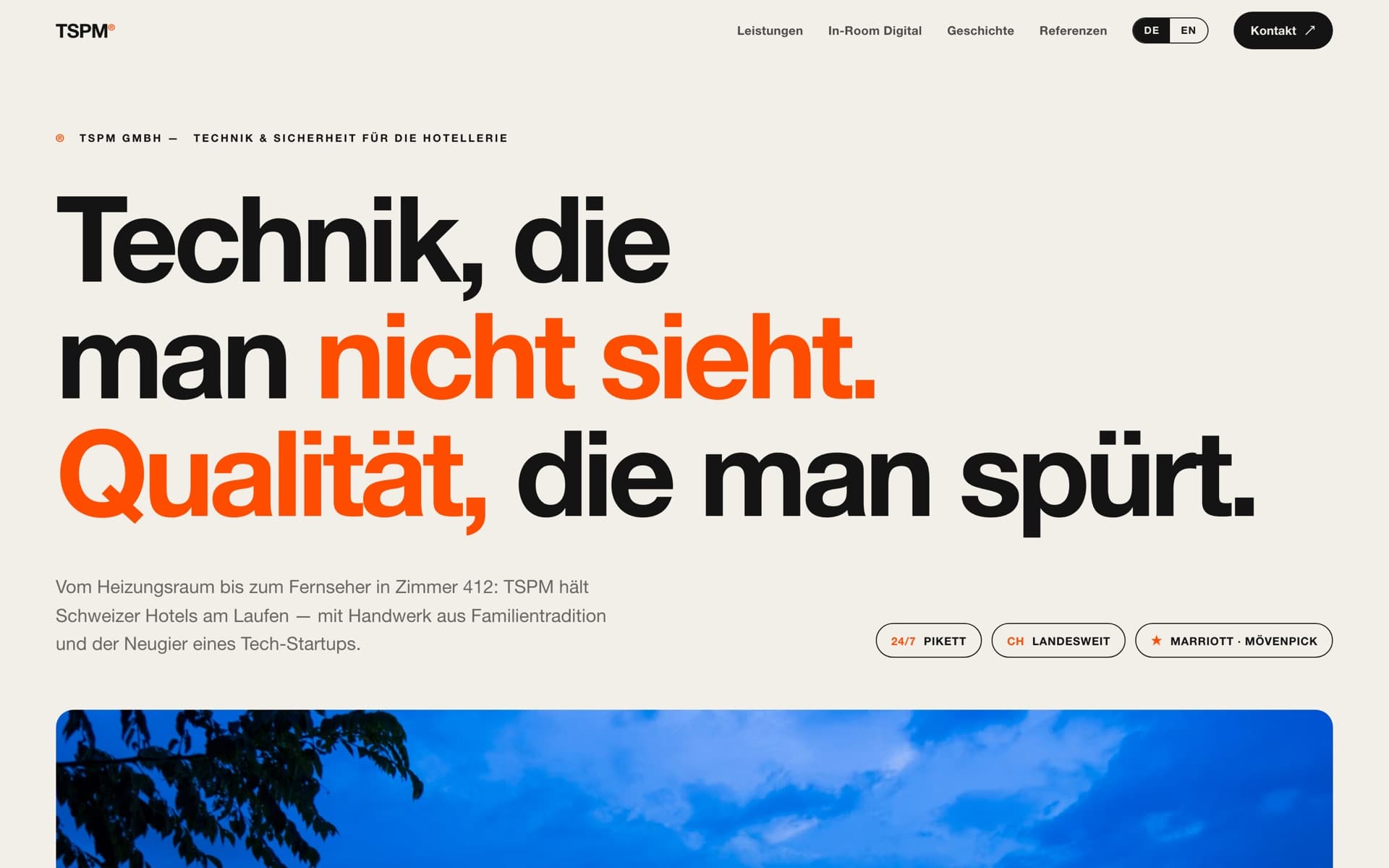
tspm02.wrk.incOne page · DE/ENThe same content as 01 in a light form: warm off-white, black type, one orange on one phrase per headline, numbered sections, services as a clean list with greyscale images, an outlined “Contact ↗” button.
- Strengths
- The most legible and balanced of the three. Restrained, Swiss, confident. Headline and typography are the best design ideas across all three sites.
- Weaknesses
- Eleven offers promise a lot at once. Figures, brand names and quotes need backing before they go public. Stock photos, no address, no region. A single page, so little for Google.
Concrete, regional, verifiable
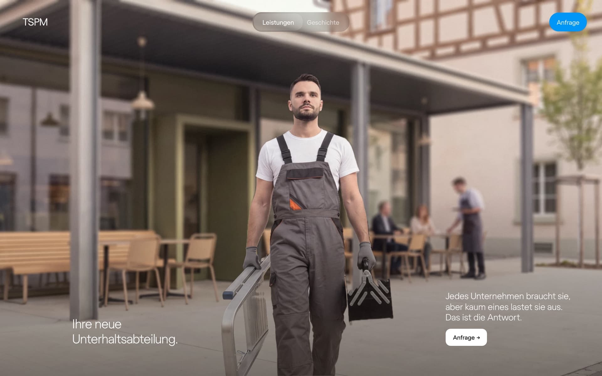
tspm03.wrk.incSeveral pages · DE“Your new maintenance department.” Three services with clear terms (maintenance, fire safety, installation), standards VKF, Suva, SIA, ESTI, phone, address, a named contact and the process “Three steps, no call centre”. A dedicated “History” page from 1896 to today with an archive photo. A consistent photo series with technician, kitchen and van in Winterthur.
- Strengths
- A credible promise, concrete terms, a person with a name and a history nobody can copy. The process answers the questions customers actually have. Real subpages, easy to find for Winterthur and Kanton Zürich.
- Weaknesses
- German only. Deliberately lean navigation and restrained design that makes less of an impression than 02. The hotel ambition is not yet visible.
The same criteria for all three sites. The last column shows what the proposal makes of them.
Sideby side.
We built the three versions before that question had a concrete answer, and deliberately settled design and structure first: the “what” is the part that is easiest to adjust later. Now is later.
The biggest difference isn’t the look. It’s what each site says TSPM is.
A technology partner for hotels with references.
A maintenance contract with a named contact.
Both are right, but only one can be closed right away.A website sells on credibility; that is what the tspm03 content stands for. The 02 design is calmer, prouder and more legible. The proposal takes both, and this document is where we settle the “what” together.
What makes 02 strong comes onto the tspm03 site. What makes tspm03 strong stays. Ordered by impact.
Proposal.
Your site, your style.The colours, type, texts and tone of tspm02 can be carried over to the tspm03 site in full if that is the direction you prefer. In our view the tspm03 design is a very good and more fully developed one; what matters, though, is that you recognise yourselves in your website. Question 7 in the form records your choice, and we build it exactly that way.
The headline
Adopt“Technik, die man nicht sieht. Qualität, die man spürt.” as the first line, “Ihre neue Unterhaltsabteilung” as the second. The better promise and the better explanation, together.
Four languages
AdoptGerman, French, Italian, English with a language switch in the header. That makes the site Swiss-wide. Details below.
Figures you can sign off
AdoptThe “Reliability, measured” band from 02, filled with verifiable values: since 1896, generations, response time in Kanton Zürich, buildings under contract.
References with names
AdoptThe three-quote layout from 02, as soon as a customer agrees with name and company. One quote with a name weighs more than three without.
Hotels as the fourth service
AdoptVisible next to maintenance, fire safety and installation, with what is deliverable today: technical direction, maintenance, SIBE, training. IPTV, casting and room automation follow with the first project.
Full navigation
AdoptServices, Hotels, History, References, Contact, language switch and the “Contact ↗” button.
The timeline in a new form
AdoptThe history 1896–2026 stays, in the two-column list from 02 with the year in orange.
Process, standards, address, contact person, photo series
KeepThese are the reasons tspm03 brings enquiries. They stay, only in a new form.
Maintenance remains a business of proximity and belongs in Zürich. Hotels, SIBE mandates and training are not tied to a region: a hotel in Lausanne or Lugano buys external safety officers just like one in Winterthur, and its management reads French, Italian or English.
Swiss-wide.
Main language, all services. Maintenance in Kanton Zürich, hotels and training across German-speaking Switzerland.
Romandie: Geneva, Lausanne, Montreux, Valais. Hotel and safety services, process, history.
Ticino: Lugano, Locarno, Ascona, with a dense hotel sector. Same scope as FR.
International hotel managements and facility managers in all regions. Full scope as DE.
Paths, translation, phone
Own paths per language (/de, /fr, /it, /en) so Google shows each version in the right region. Translation by specialist translators, because terms like safety officer or emergency lighting have fixed technical terms in FR and IT. Calls are answered in German or English; the site says so honestly.
Anyone who liked 02 will recognise it immediately. Every word and every page stays what tspm03 already has. Five steps.
Delivery.
Warm off-white, near-black, one orange for accent, markers and primary button. The tighter, heavier typeface from 02.
Text links, language switch, “Contact ↗”. Large headline with an orange phrase, three fact pills, technician photo below the text.
Services as numbered rows with greyscale image, process with numbered eyebrows, standards as a row of marks, one section on a dark surface.
Timeline in the 02 style, references as three cards, contact with form next to address and phone.
Four language versions, check on the phone, side-by-side comparison with 02, live.
Timing.As soon as we have your answers, we start right away and complete the work within the same week. Translations run in parallel.
These questions decide what gets built. Please answer what you can and put the rest in the comments. The button at the end sends your answers straight to WRK.